The task of designing that new Enterprise fell to Sean Hargreaves (who also designed the USS Franklin and Starbase Yorktown). As you can see in the images below, which Sean has released, he skillfully blended the key shapes from the original, prime timeline, Enterprise, with new organic forms, that makes this new USS Enterprise-A both familiar and very new.
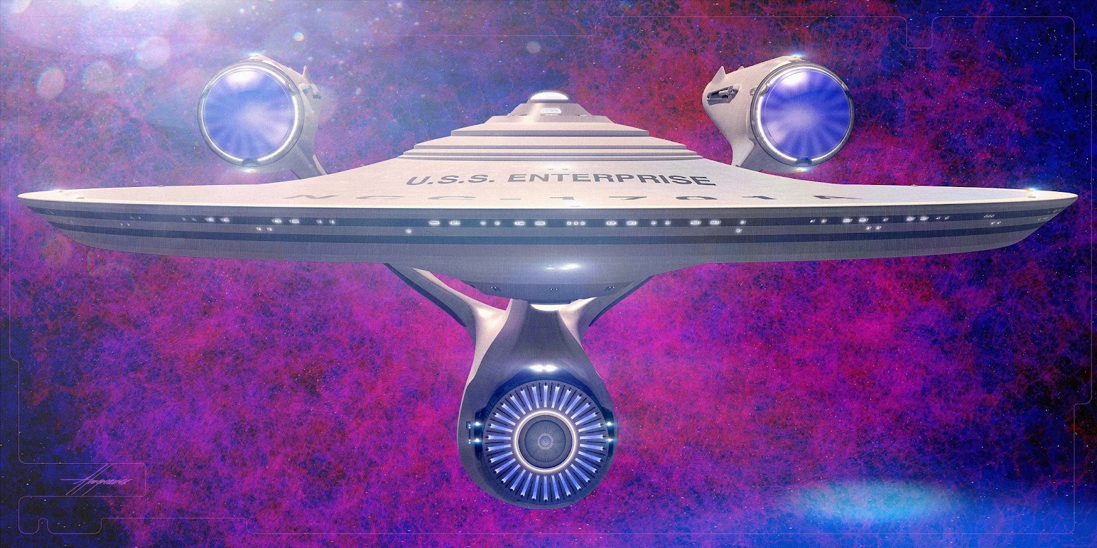
Sean described his brief when he shared these images on Facebook:
This was the design I gave visual effects, so any changes beyond what you see here were out of my hands, but looking at the film its pretty close.
The brief was to beef up the neck and arms, but I took it upon myself to go further. Certain details and livery are not present as I took it to a certain level, time permitting. Also the classic red graphics were placeholders at the time.
I worked many long hours at work and after work and weekends on this, knowing the weight of the responsibility, which I didn't take lightly.
From growing up watching Star Trek in the countryside of Northern England, this was a great honor to be one of the few to be given the great responsibility to design this ship.


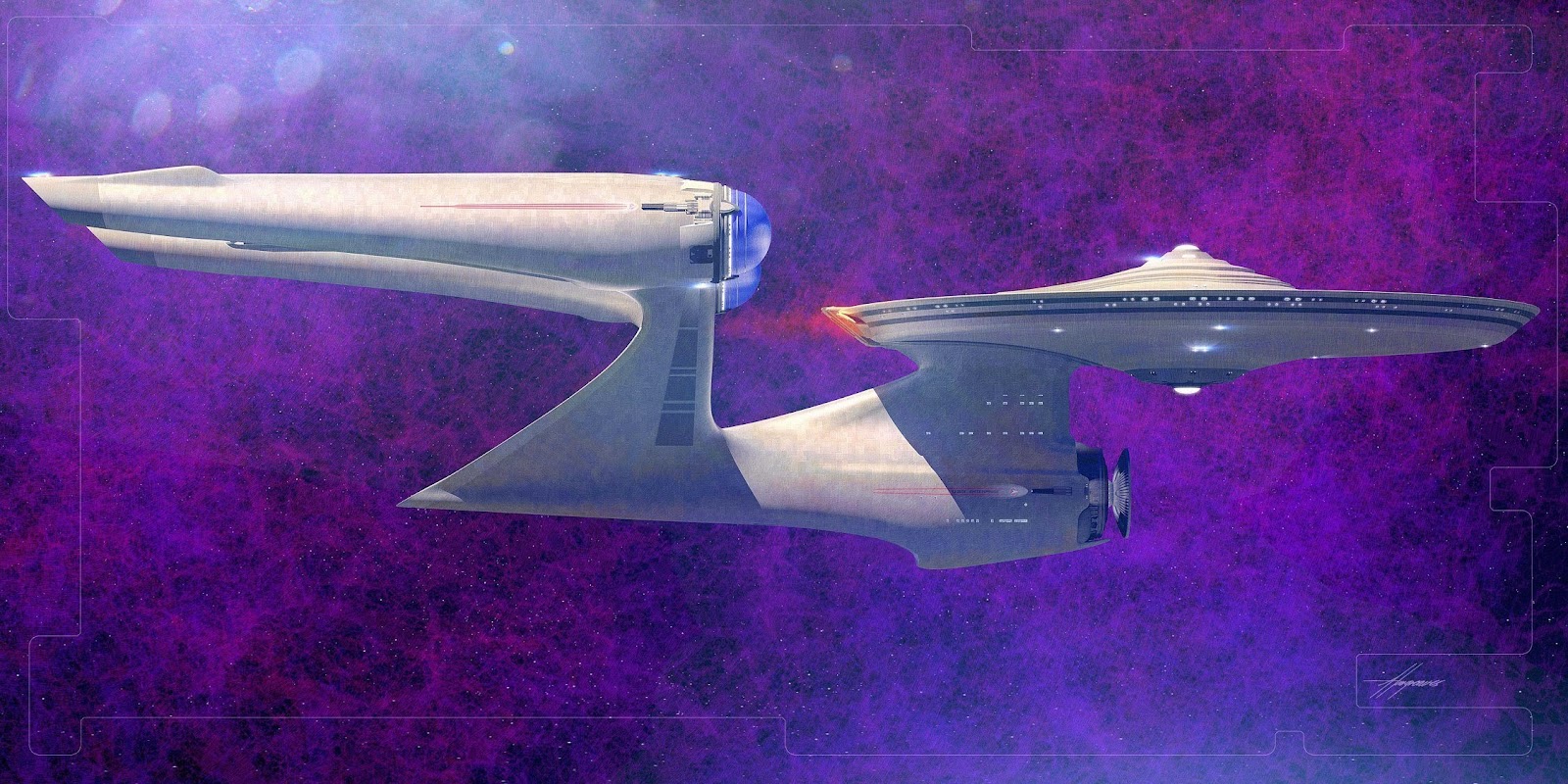
I especially like the rear view above, the way the pylons blend into the engineering hull and create on continuous form between them is pleasingly Calatrava-esque.
Paramount have yet to release any official images of the new Enterprise-A; indeed the shots of her were some of the only ones in the film not revealed at all in any of the trailers! So it will probably be a while longer before we can really scrutinise the final design as seen on screen. But the artwork above gives us pretty good idea, as not too much was changed, and I think she looks like a splendid ship!
You can see more of Sean's work from the film in my previous reports on the USS Franklin and Starbase Yorktown. Sean has made some of his work publicly viewable on his Facebook profile, and you can see more of his wider portfolio on his website. To keep track of all the latest information on Star Trek Beyond, including other behind the scenes coverage, visit my Star Trek Beyond guide page. I'll be posting even more concept art from the film in the coming days.

27 comments:
Sorry to be negative, but this a bad design, worse than JJ's....and didn't think it could get uglier. Proved wrong.
Please do not post pirated video here, as was the case in the comment above which is subsequently now deleted.
Looks a little better here, but it was ugly as sin in the film. And it really annoys me that ",The brief was to beef up the neck and arms," essentially amounts to undoing the changes they made to the first one for the start of 'Beyond'just so it would look weaker, which already ruined the look of the 09 model.
They should have just ended the film with the crew looking at the unfinished, but still recognisable space frame instead of rushing this thing out.
Why would they make the ship look more boxy and less fast? This looks more like the ship that would have come before the '09 Enterprise. The nacelles pylons, swept forward at the back and squared off at the front? We've seen that in concept art from other trek movies where they had to design a new Enterprise, and it was always, in my opinion, wisely rejected. The neck is almost the same, squared off front swept forward back, makes the ship look like a swan. Sorry, I'm not a fan.
Calm yourselves people. I'm sorry to Mr. Hargreaves that he put so much work into this thing and only about 75-85% of his work made it into the final product. The entire bridge module and the staggered decks under it are changed completely in the final film. The impulse drive is slightly different. The neck and warp engine pylons are almost totally different. The neck sweeps forward and doesn't have that massive curve just before it meets the saucer in the final version, as well as having a forward mounted photon torpedo launcher as on the previous design. The trailing edges of the warp pylons join with the side of the secondary hull as on the previous design as well. The shape of the saucer, secondary hull, and the warp nacelles appear to be the only things really left unchanged in the finished product.
I definitely like it better than the nu1701, if only for the fact that the nacelles are now properly balanced with the rest of the ship... but I'm still not a big fan.
One of Jeffries' original intentions designing the 1701 was to make it look as though it were constantly defying gravity--that's why the nacelle pylons are so tiny and attached to the front of the nacelles and why the neck is so thin--and Probert took that concept and ran with it when he defined the entire aesthetic of the franchise. Including (crucially) the tmp1701's pylons that widened near the top. The idea was to put all of the "weight" up high to imply a sort of gravity-defying floatiness to the design.
And Probert succeeded beautifully.
But it's pretty clear that no one working on the nuTrek movies had even the slightest desire to follow the same general thoughts that defined the franchise, to the point where the nu1701 and nu1701a feel more like reactions *against* Jeffries' and Probert's work.
Just got used to the '09. I never really liked the large nacelles though.
Why do the film makers take delight in destroying the Enterprise?
I absolutely loved the redesign of the 1701 for Beyond. The swooped back smaller nacelles were (in my opinion) exactly what it needed from the beginning. It was even neat how the attack on the Enterprise was based on the design. But this A design is just awful, literally backwards as far as esthetics go. I hope they go right on to B after the fourth film...
You know, destroying the Enterprise every few years kinda defeats the purpose of seeing this vessel as another valuable character in the storyline. It would be like blowing up the Millennium Falcon at the end of each SW movie. Doing so waters down the ships' history, it retains few "character" traits. It just becomes a generic presence with the Enterprise name slapped on it. I actually LOVE the JJ Enterprise. Ryan Church is a masterful designer. I'm an artist, and from my experience, that ship was a perfect blend of form and function. Great lines, voluptuous... and worthy. When Kirk destroys the E in STIII it had meaning. The ship had a long history and had seen the crew through thick and thin. Now, Its just another "redshirt". Not to mention, part of the Trek legacy was the idea that Kirk could see his ship and crew through each harrowing event with nary a scratch.
This ship ? Misses. It just doesn't work. JJ Prise looks stronger and more defined. They only had to update it slightly and it wood of looked way cooler and look like a real upgrade/refit. This new ship does not look real, more like some artsy yepy art Peace (and the back does look like a berd but in a weird way ).
I finally saw the movie and im glad to see that this is just concept art. The filmversion keeps more the look of JJ's 1st Enterprise, this one shown here,for me at least looks absolutely bad, the pylon structures and the neck are way to fat, the proportions of the saucer section an the rest of the ship doesnt work in this concept. This is of course just my personal oppinion and shall not offend the designer.
Intersting concept art, but not the Enterprise-A in the movie. I a very big fan of the version we got on screen, as it much more closely resembles the classic Constitutuon design we grew up with.
Speaking as a graphical artist, I have to say this concept art is pretty harrowing. Not only has the artist taken what little charm and appeal the JJ'prise had and removed it, but they've manage to make the design worse. The whole lower section feels uninspiring and really lazy. Like someone was playing around with the subpatch tool and stumbled around an appealing shape. Lord the warp pylons and the neck alone are making my eyes want to water. Where did inspiration for this design come from? The bin labelled "Past Enterprise Rejects"?
Its hard to believe anyone could grow up watching Star Trek and still manage to make what ever this thing is.
The nacelles are improved, but the pylons are too thick and are too far back on the engineering section and too far forward on the nacelles. I would like to get a better look at the final film again to see what was different between concept and screen.
This is one ugly mother f***** from the side view, it is just plain dame SH*T! and looks like a major step back in ship design, the warp nacelles are too similar to the Franklin which is supposed to be a very old ship, they had better massively improve this by the time the next movie comes out!
I have seen the movie twice and was disappointed when I saw it on screen but this concept just really is a MAJOR step back!
I absolutely adore the 09 style Enterprise we've had for three movies. This however is really ugly. Because it shows up so briefly in the film I can only hope and think that they're going to revise the design more by the next film. Especially considering JJ is going to be the director again and may wish for another design.
I love and have been a Star Trek fan since the very first episode of the original series. In all that time and right up to the movie, 'STAR TREK: Beyond', i can honestly say that all the designs for the military battleship Enterprise have totally sucked; it looks like a toilet seat with handles. Having said that however, they were never designed for real world thinking purposes but, purely for television dramatic design flare. In the early years that was fine as, after all, it was a fantasy series etc but towards the end of the 20th century we should have been seeing ships that were totally different in design and shape...even more so now that we are in the 21st Century. The designs are just exagerations of early UFO sightings which the public was more aware of back in the 1960's and were therefore more able to accept the sci-fi aspect of it all.
In todays modern look, way of thinking, expectations and attiudes a ship of this design would be laughed at by any military race of beings. It wouldn't last 2 minutes in a battle scenario because its shape, not size, just makes it an easily hit target. I've never understood why it had to be such a big ship except that with American idea of things, everything always has to be big and dramatic rather than sleek and deadly.
By the way as a finishing note. No one design is ever going to please EVERYONE...that's just the way of the world peeps!
Live good and prosper resonably.
This is without a doubt the most hideous and awful design for an Enterprise I've ever seen. Eugh, what was the designer thinking?
In my opinion, the Enterprise A has one of the nicest designs in Trek history, a compromise between practical and graceful. This looks like a deformed mutant cousin of the already ugly Abrams-verse design.
I really hope they fix this horrendous visage in the next film, this is ridiculously ugly from all angles.
Not a fan of the JJ Enterprise or on these images this new 1701-A update. I'll admit the new A did not look so bad on the screen but we only got a quick glimpse and being honest neither of the nuTrek Enterprises are a patch on the original Enterprise or the refit, which is with out a shadow of a doubt the best looking Enterprise. Hopefully they will do something about the god awful design before the next movie as it would not take much to fix it. The problems for me are in the engine nacelles. They are too close together and a touch to bulky for my taste and the pylon mount needs to come back from the Bussard collector along with the pylon needs inverting so its wide at the top and narrow at the engineering hull. Someone did a very good render of what I am talking about and it looks miles better than anything that has come from the studio.
Okay back with an update on my views of the new Enterprise-A seen in beyond!
Now that i have the Blu Ray of this film, i have frame by frame watched the new ship and while it is clearly a massive improvement over the UGLY concept art, i personally hate the design of the warp nacelles as they look like star fleet went through their garbage bin and thought yeh lets stick these on the ship! rather than use more advanced ones, even if only aesthetic.
This new ship is supposed to be the most advanced in the fleet so why have they gone back to 3 banks of phasers top and bottom of the saucer? the 1701 in this film had been upgraded to 6 banks, now the 1701 in this film has had some major changes to it such as: more windows around the saucer edge, swept back warp pylons, smaller warp nacelles, taller and thinner neck, which has made it ugly and fragile which i can only assume was to make the effect of having it cut to pieces by the swarm more dramatic! another theory i have is that by making it look like its been on diet gives the new 1701-A ship an even beefier chunky look.
I think the people who produce Star Trek films need to spend more time on making sure that there is continuity with the ships and also sizing, for example you only have to look at the Klingon bird of prey used in TNG, its the same model used in search for Spock but in TNG they wanted us to believe it is a much bigger ship! what total CRAP!
I love Star Trek and the Enterprise ship, and it very disappointing when they don't seem bothered to put the effort in or enough of it!
Just realised i forgot to mention about the mistake in Beyond, when the Enterprise is under attack by the swarm, in one of the shots the Enterprise has reverted back to 3 bank configuration of phaser banks "underside of saucer" and the neck looks chunkier plus the forward facing photon launcher looks smaller, i bet they used the CGI model from the 2009 movie, they really need to communicate better between departments or studios! as this is what happens no continuity "sort it out" people!
Agree completely, this Beyond-A is an absolutely hideous monstrosity. It is far too organic in form and just looks completely ridiculous, especially from the rear. Even the godawful Enterprise D and unbearably ugly Voyager aren't this bad and those things were beastly disgraces. It is an unseemly abomination from every angle. The 09 Enterprise, although inferior in every way to the prime design, is infinitely preferable to this grotesque mess.
Yeah. By all means. Let's just freaking destroy the Enterprise again in the fourth movie. And build another one at the end of that. Then destroy that one in the fifth movie. And keep going on and on and on and use it as the signature segway device from film to film until we exhaust the entire alphabet. Then we can continue the process further with Roman numerals. And since numbers have no end we can do this forever. Into infinity. Boldly going where no man has gone before. Literally.
Try to un-see this: Thanks to the pylons connecting to the engines far forward and also connecting to the secondary hull far aft, from the rear the ship looks like a woman spreadeagled and displaying her genitals (the landing bay).
Strange choices there.
Click here |Norton Antivirus Support phone Number
Click here |McAfee customer service phone number
Click here |Phone number for Malwarebytes
Click here |Hp printer support windows 10
Click here |Canon printer support telephone number
Post a Comment