UPDATE: StarTrek.com have posted their usual article about the new posters, with commentary by the artist, quoted below:

I originally had a Busby Berkley idea with this one. It was leaning more towards an Art Deco feel, but I felt that the elements and also gradients were a bit too distracting. So I toned it down quite a bit

I always wanted to try a comic book cover for this series, but I didn't want to just copy the Gold Key versions. I wanted limited colors with more of a pop-art feel to it. I've always been a big comic book fan, especially any by Jack Kirby. The sound effects add to the pop-art feel.
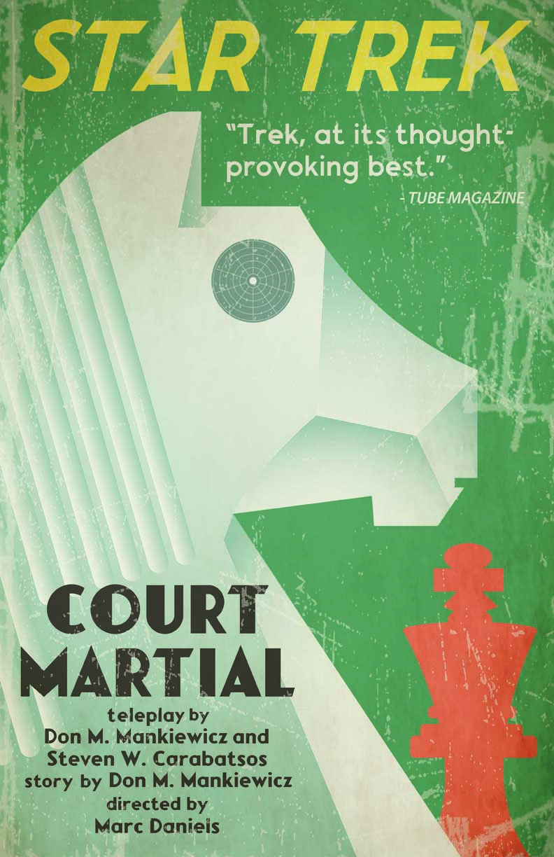
Chess has always been an important element on Star Trek. When we first meet Kirk, he's playing chess with Spock. In “Whom Gods Destroy,” Kirk and Scotty use a passcode based on a chess move. In this episode Spock plays chess against the ship's computer and is able to make a discovery that will later exonerate Kirk of negligence.

That Which Survives
This was another Russian inspired poster.
I wanted something graphic, with little detail. The hard part was not rendering lines and windows onto the Enterprise. The placement of the episode title came out of necessity. Once the illustration was done, I had to figure out how to fit the title and credits.
Posters, T-shirts, and glasses featuring these designs should all be on the way soon.

No comments:
Post a Comment